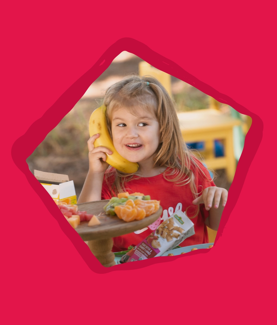
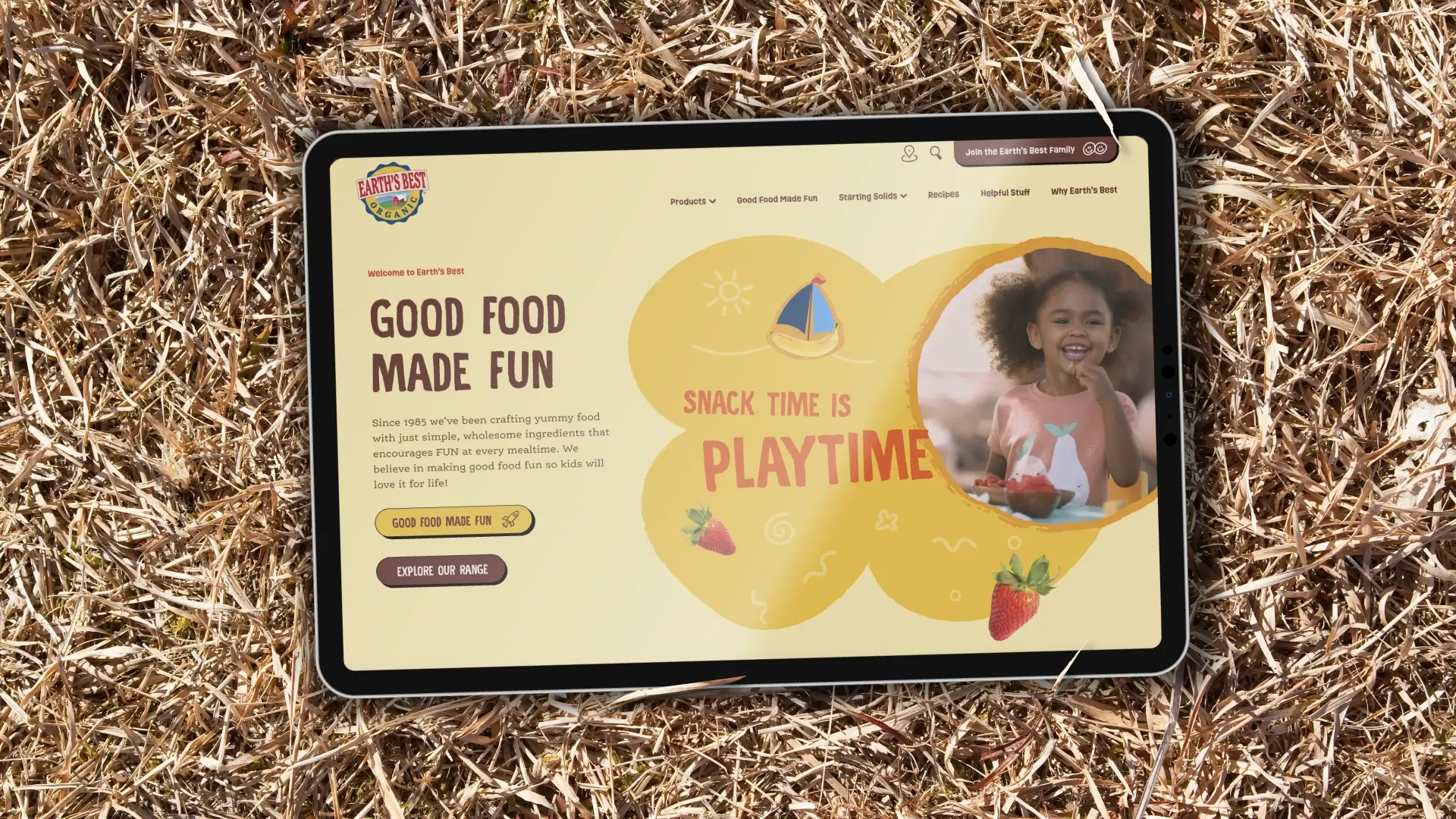
Good food made fun.
Branding, Comms
As pioneers of organic baby food since 1985, Earth’s Best are on a mission to make good food fun for every little one across the US. With a wide range of yummy products already loved by little ones, the Earth’s Best brand identity needed to live and breathe the mission, building a deeper connection that inspires and educates both kids and their grown-ups.
Inspired by what makes kids, kids
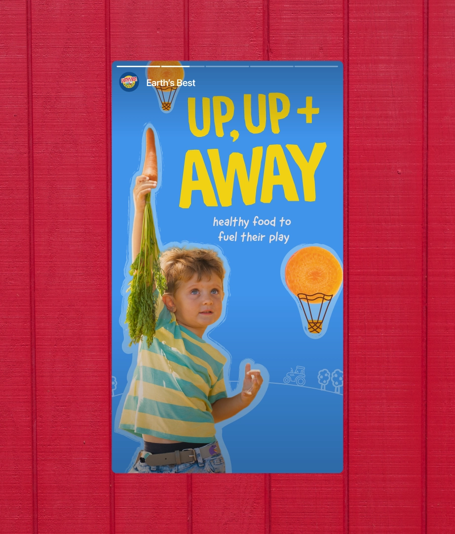
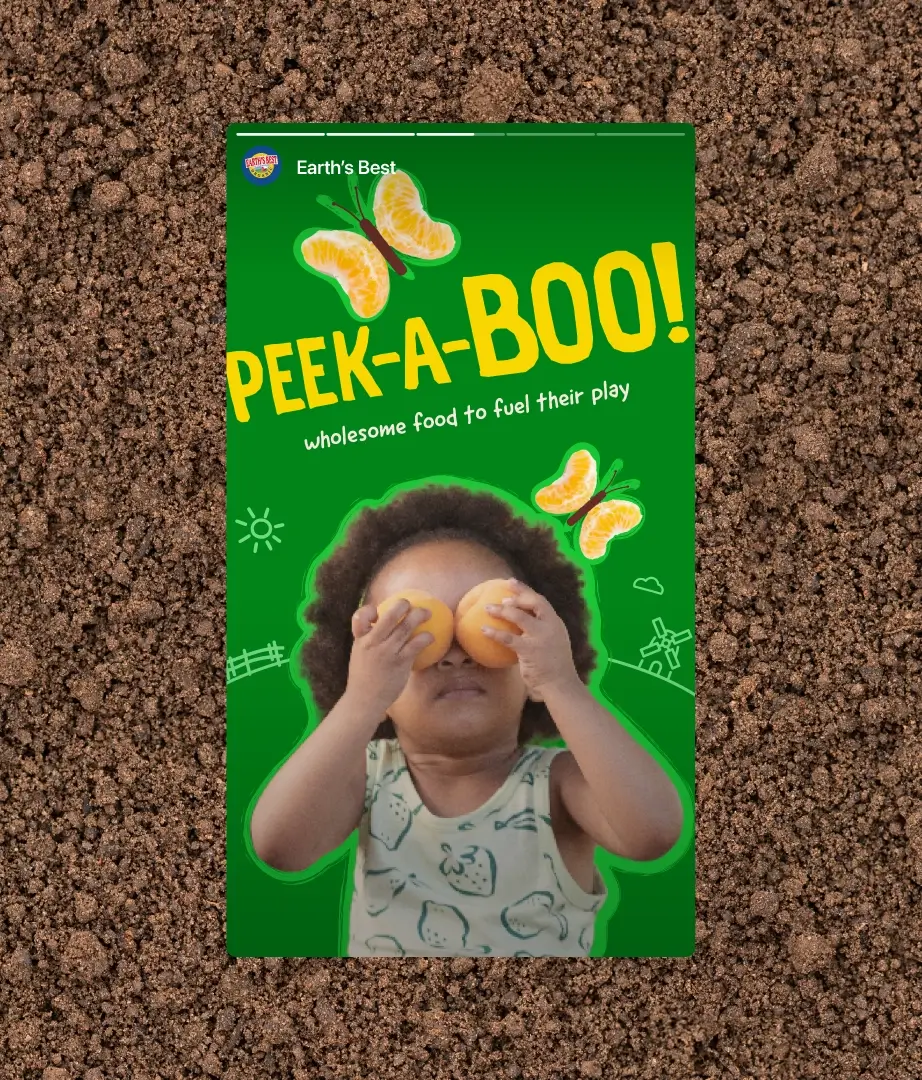
Blue skies. Green grass. Zingy fruits. Earthy veg. All of these things, and more, bring wonder to little ones’ lives, so we used them as inspiration for the colour palette.
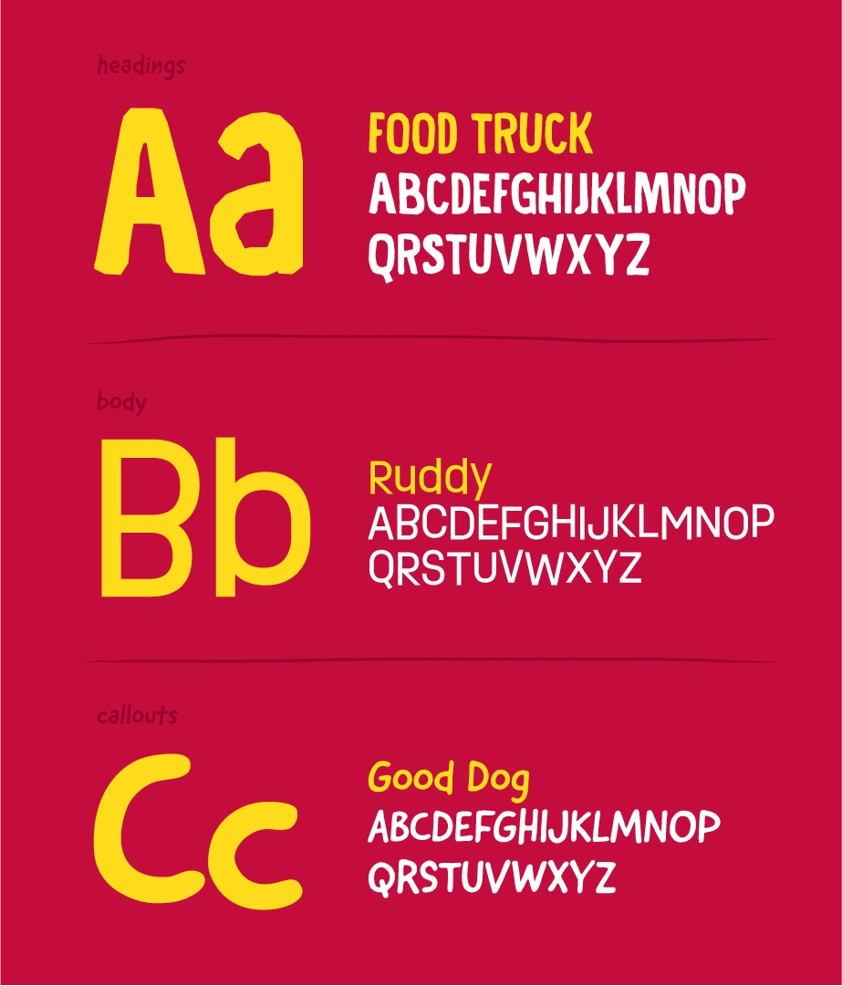
Similarly, the typography leans into the imperfect and charming nature of kids’ lives, made up of three childlike fonts that range from wonky and hand-cut to hand-written.
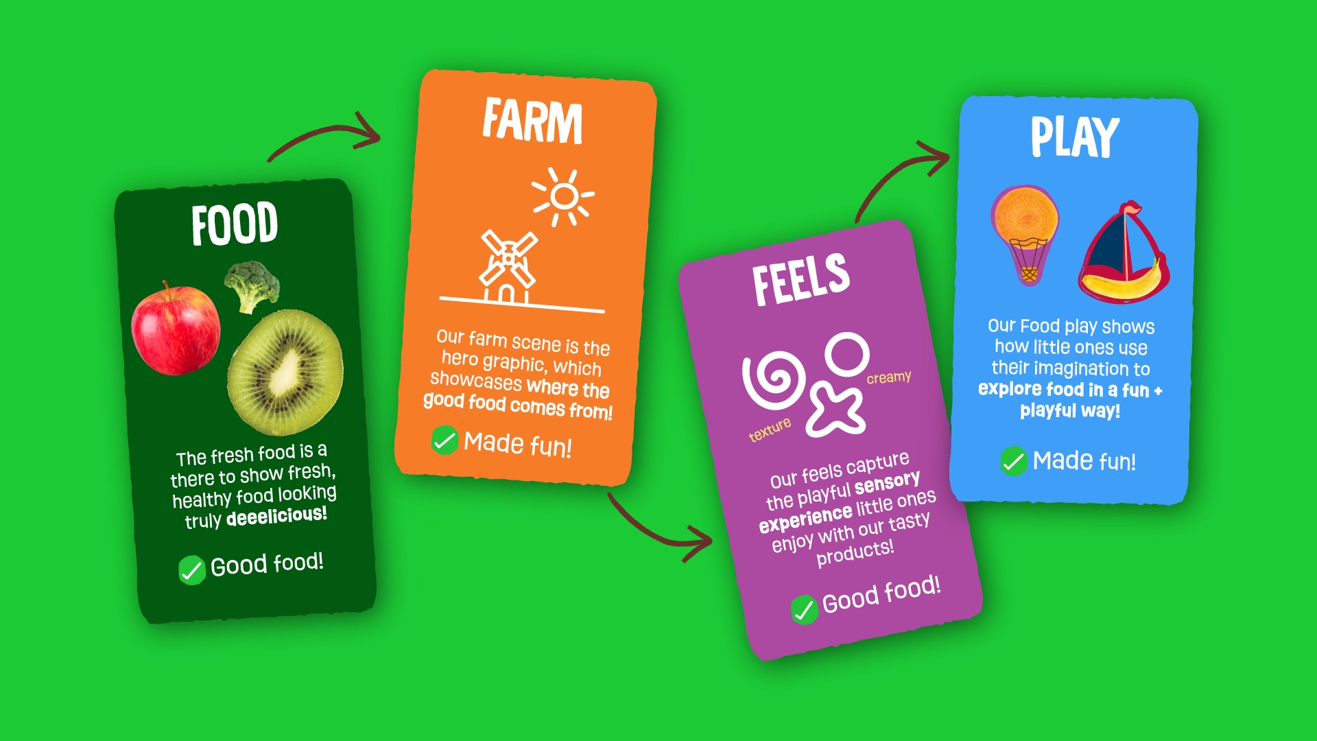
Bringing good food to life
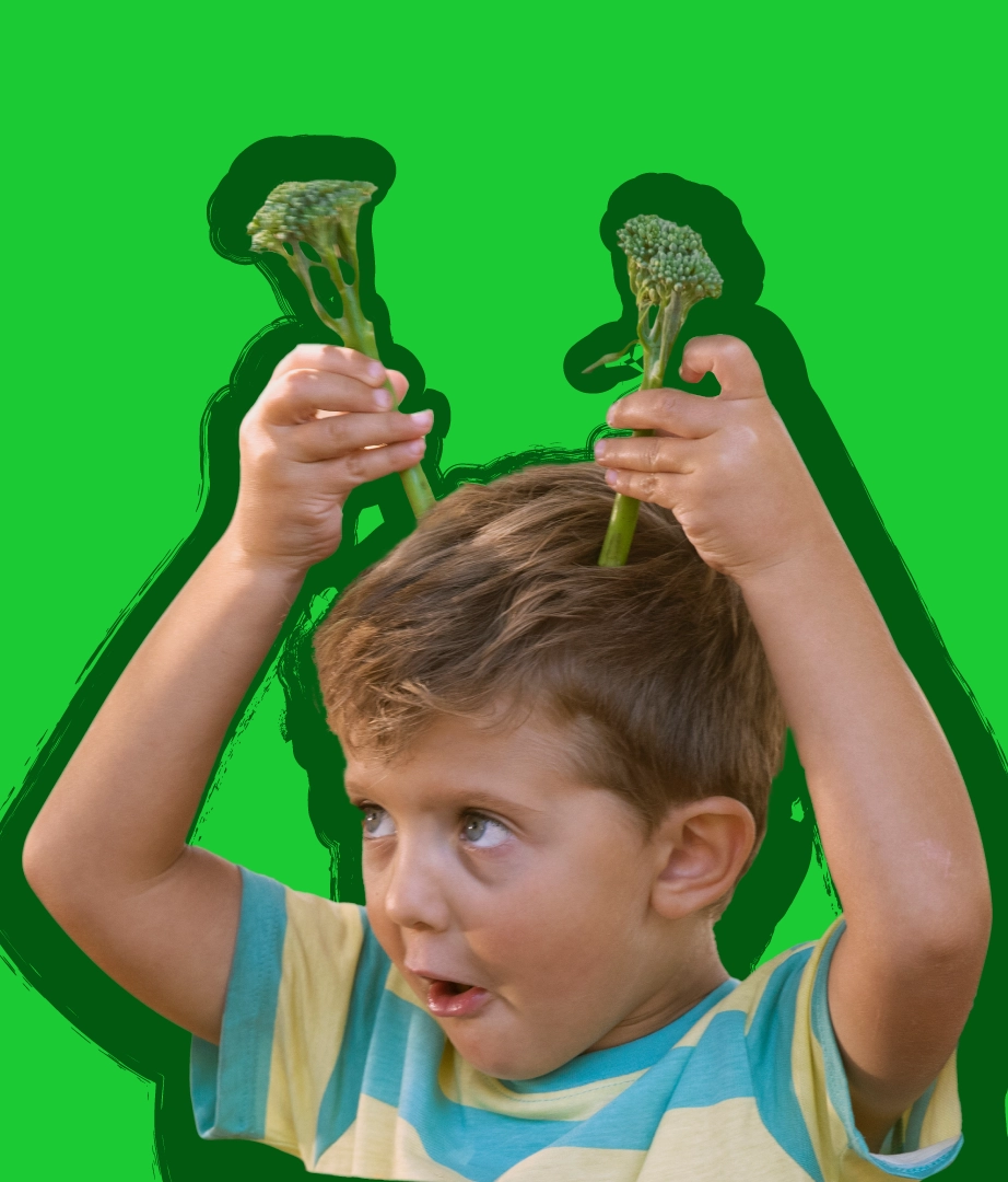
Good food is the champion of the identity. Visually transformed into magical creatures or objects, from bugs to rockets, that celebrate pure imagination and sparks a sense of connection for little ones to the world around them.
The love of good food comes from those big yummy tastes that bring joy to little ones’ senses. So, we created a collection of doodles that capture the shapes they see, the crunches they hear, the bumps they feel and the zingy flavours they taste.
More good stuff.
Let’s shape
what’s next.
We put ourselves at the heart of your brand to define ambitions, drive creative and create experiences that keep your brand moving forward.