Moving the talent that moves the world.
Branding, Tone of Voice, Comms, Guidelines, Website, Motion
BTR doesn’t just move employees from A to B – they create unique, stress-free relocation experiences for businesses and individuals alike. As the old-school world of corporate mobility remains stagnant, BTR is redefining what it means to move employees.
They needed a brand that was as bold as their vision. One that shifted the focus from just the individual moving to the teams managing the relocations. Together, we set out to build a brand experience that feels human, personal, and perfectly aligned with their mission to always be one step ahead.
Turning the ordinary into the extraordinary
BTR’s philosophy is simple: make the complicated feel easy. We took this approach and used it to breathe new life into their existing identity – making it bolder, more emotional, and easier to use.
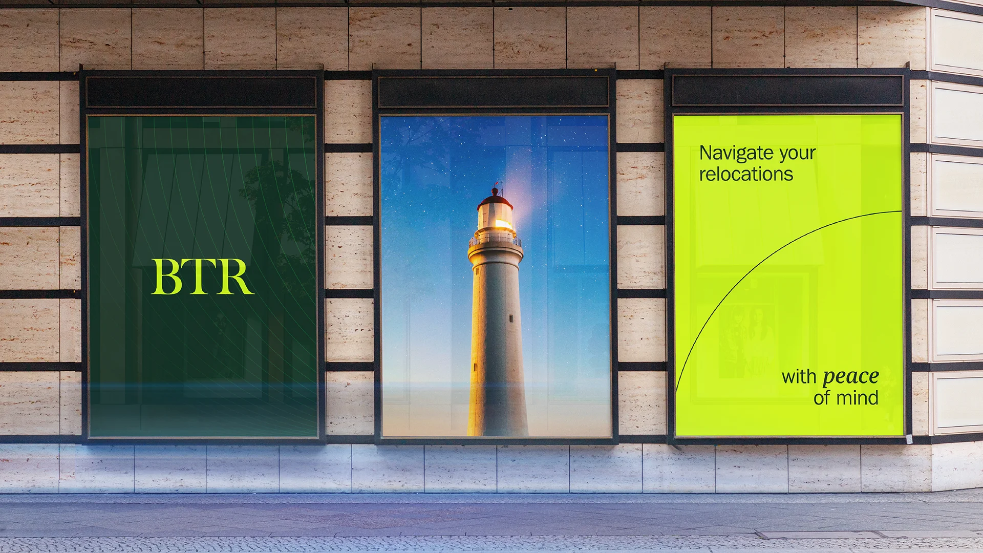
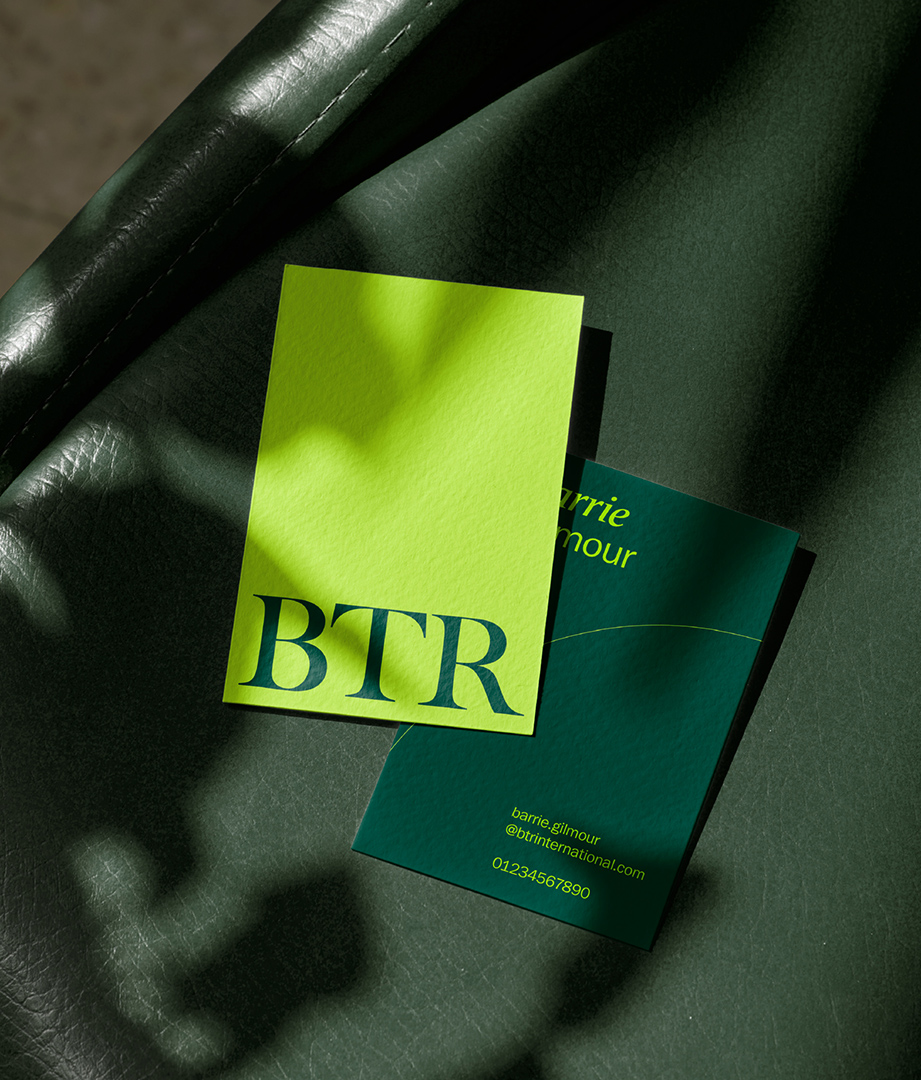
The logo was refined, becoming more streamlined without losing its trusted feel. From there, a vibrant new colour palette was born. Bold greens pack a punch, adding a sense of energy and down-to-earth sophistication that helps the brand stand out in a sea of corporate sameness.
Illustrations play a big role in breaking down the complex processes. These playful, expressive visuals not only simplify the details, but also bring a sense of joy to the experience. Turning what could be overwhelming into something that’s easier to understand.
Together, these elements transform the complicated into something refreshingly simple, and add a little more delight at every step.
Design that moves with you
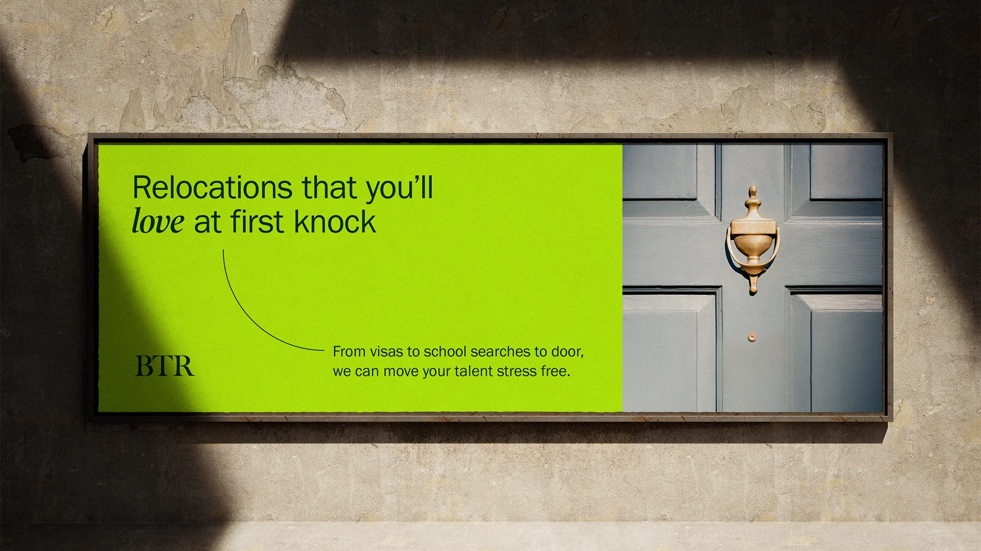
Relocating employees across the globe is no small feat, but BTR makes it feel so effortless. To reflect this, we created the Arc – a clean, clever design element that stands for movement, connection, and ease. Whether it’s linking words with images or bringing structure to layouts, the Arc captures the feeling of a smooth, seamless relocation.
The Arc naturally evolves into the Ripple, a pattern that adds texture, depth and motion to the brand. It’s a subtle nod to the lasting impact BTR has – just like ripples in water, their work goes far beyond the surface.
Beyond the boxes
We wanted to move away from the logistics of relocations and instead highlight the emotional journey. While the process itself might feel routine, for the people moving, it’s personal.
BTR’s imagery reflects that. No more tired images of cardboard moving boxes. Instead, we focused on what really matters – personal moments, like treasured items, favourite local spots, or a stroll on the beach with the dog. These images tap into the emotion of moving, showing how BTR helps make the transition feel like home, not just another logistical hurdle.
Adding a spark to digital
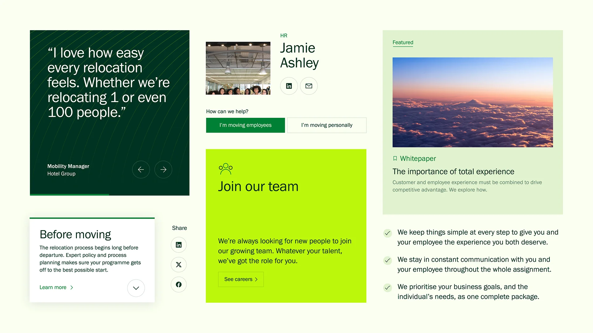
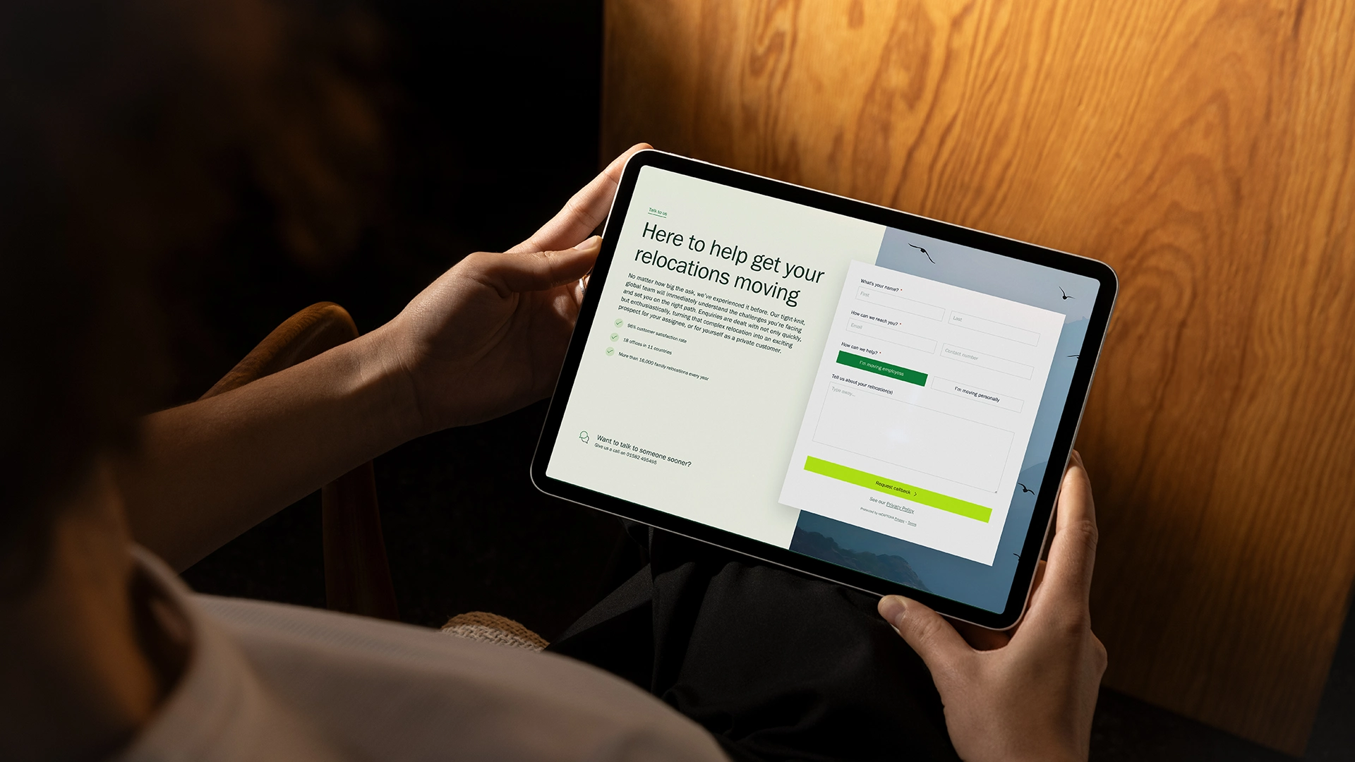
We brought BTR’s digital world in line with their real-world service – approachable, straightforward, and always customer-first. From the ground up, we redefined their digital strategy, design, and content to build a more meaningful, engaging experience – all powered by WordPress.
With a unified digital design system in place, BTR’s teams now have a scalable, intuitive platform. Equipped to easily edit, curate, and create content, they’re empowered to build and grow their digital presence alongside the brand.
Change made. Hearts won.
Since launching the new brand identity and website, BTR has seen a remarkable 300% surge in engagement. More than just turning heads in the crowded corporate mobility market – it’s giving their internal teams a brand they’re proud to own.
“Cyon aligned and understood what we were and who we were as an organisation. They were invested in making it a success and making the journey as easy as it could be – and took pride in their own output – all working with the best interest of BTR at heart.”
Barrie Gilmour, Director of Client Experience
More good stuff.
Let’s shape
what’s next.
We put ourselves at the heart of your brand to define ambitions, drive creative and create experiences that keep your brand moving forward.