A contemporary classic, reimagined.
Branding, Guidelines, Signage
Tucked into the heart of the Scottish National Gallery of Modern Art, Café Modern One has long offered visitors a place to pause, refuel and reflect — a considered blend of art, atmosphere and hospitality. But over the years, its brand had become diluted. Without clear guidance, its visual language had drifted, losing some of the charm and clarity that once set it apart.
Our challenge was to rediscover Café Modern One’s voice and visual presence. To restore a sense of vibrancy and cohesion — and reconnect space to place.
Playful by design
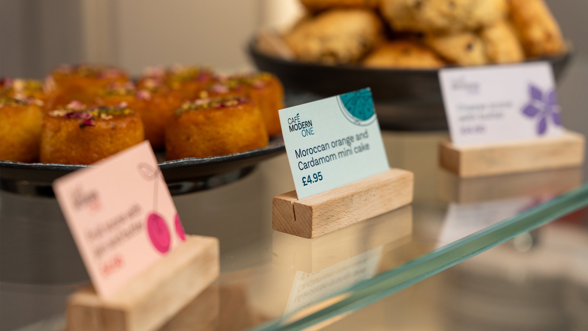
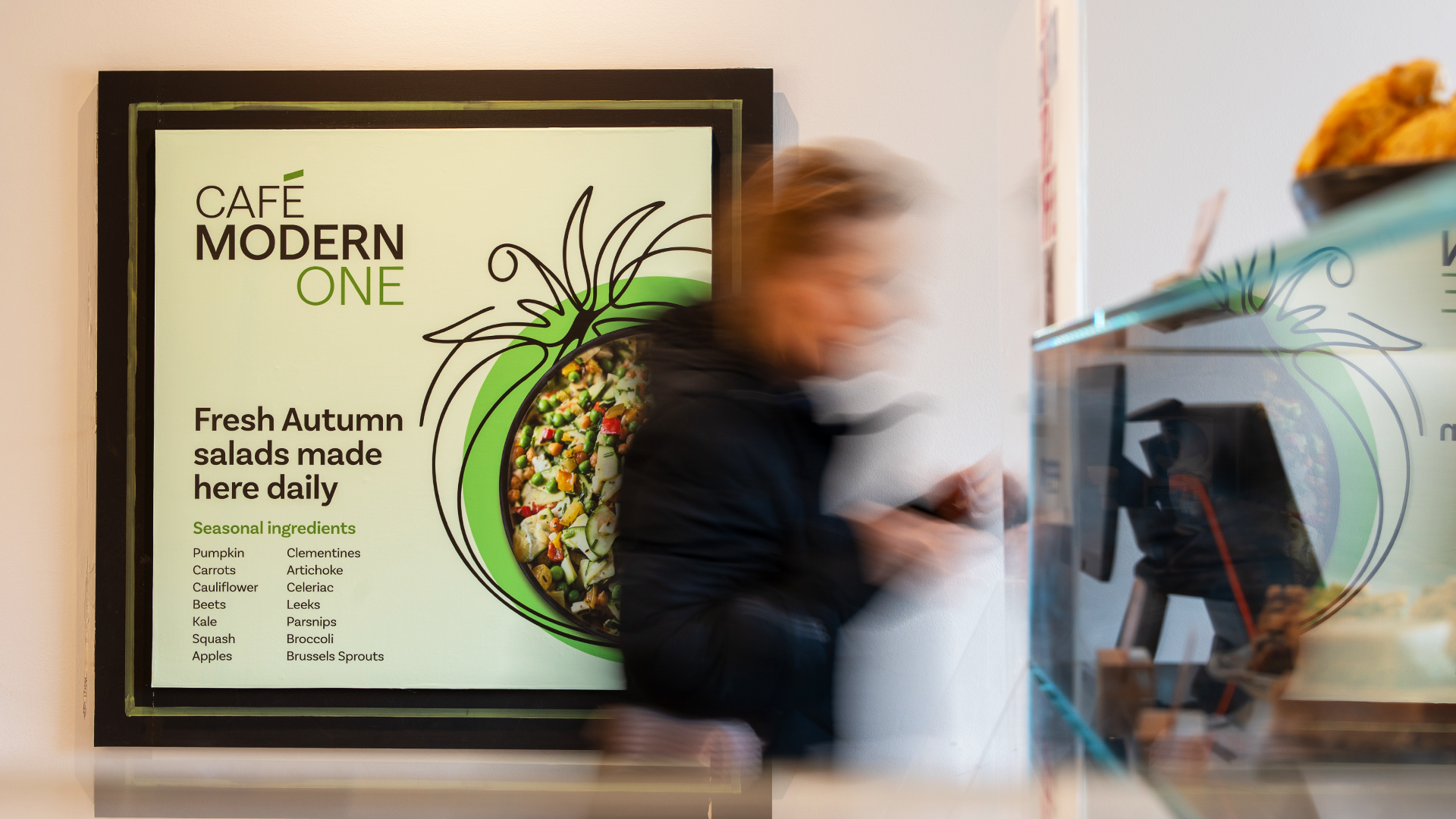
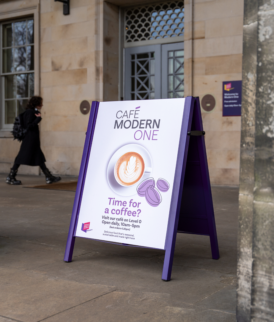
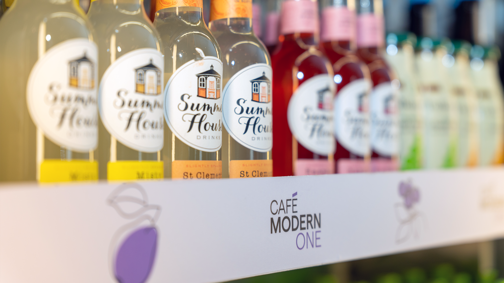
Colour and illustration work hand in hand to bring the brand to life. A palette of punchy pinks, greens and purples are balanced with softer tones to keep things joyful but grounded. Paired with playful, hand-drawn illustrations — think herbs, fruits, coffee cups — the identity feels vibrant, artistic and expressive. Cut-out photography and bold colour blocking tie it all together, creating a look that’s full of charm and unmistakably Café Modern One.
Words, warmly served
The tone of voice at Café Modern One is shaped with the same care as the food it serves — simple, thoughtful, and made for real people. Across menus, signs and social, the brand speaks in a way that’s warm, relaxed and down-to-earth. No jargon, no fluff — just honest words that feel natural, whether you’re reading them in the café or online.
Hello again, Café Modern One
The rebrand brings Café Modern One back into alignment — with its setting, its purpose, and its people. It’s a space that speaks to everyone, from gallery regulars to first-time visitors.
By rooting the design in clarity, creativity and care, the brand feels right at home in the gallery — distinctive, but not distracting and helping to shape how people feel when they walk through the door.
Café Modern One now feels like what it’s always been at heart: welcoming, vibrant, and unmistakably modern.
More good stuff.
Let’s shape
what’s next.
We put ourselves at the heart of your brand to define ambitions, drive creative and create experiences that keep your brand moving forward.